Visualization with Pandas
Written by: Marlon Colca
Posted on 26 May 2025 - 4 months ago
python pandas analytics
In this post, we’ll learn how to create quick and effective visualizations using Pandas (which uses Matplotlib under the hood)
- 01
- 02
- 03
- 04
- 05
- 06
- 07
- 08
- 09Visualization with Pandas
- 10
- csvPrices sample
- csvPrices with missing data
- csvPrices with sales
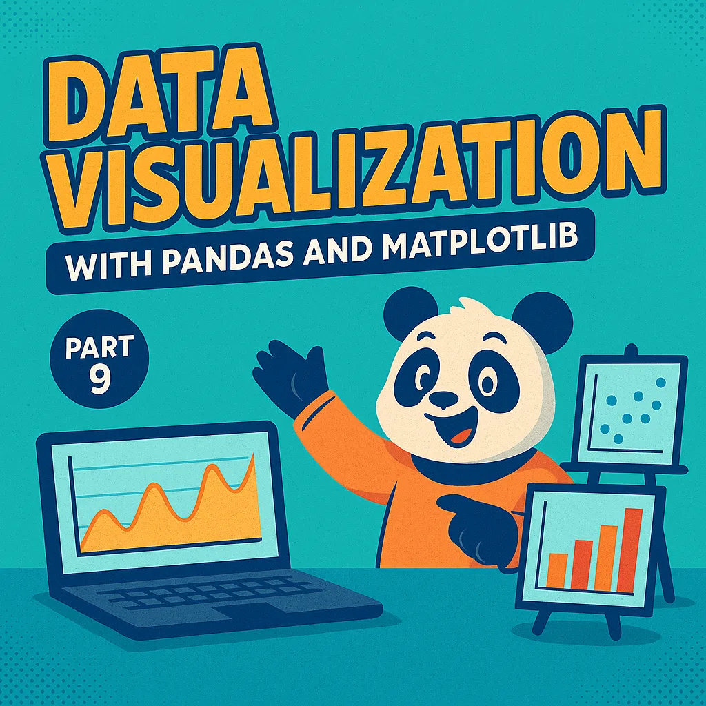
📊 Part 9: Data Visualization with Pandas and Matplotlib
Data exploration isn’t complete without visualizations.
Numbers and tables are useful, but charts make trends and outliers immediately visible.
In this post, we’ll learn how to create quick and effective visualizations using Pandas (which uses Matplotlib under the hood).
📦 Setup
import pandas as pd
import matplotlib.pyplot as plt

df = pd.read_csv("prices_with_missing_data.csv")

# Fill missing values for smoother plots
df['quantity_sold'] = df['quantity_sold'].fillna(0)
df['price'] = df['price'].fillna(df['price'].mean())
df['brand'] = df['brand'].fillna("Unknown")
df['date'] = pd.to_datetime(df['date'])
📈 1. Line Plot – Sales Over Time
Line plots are perfect for showing trends.
daily_sales = df.groupby("date")["quantity_sold"].sum()
daily_sales.plot(figsize=(10,5), title="Daily Quantity Sold", ylabel="Units")
plt.show()
📊 2. Bar Plot – Revenue by Brand
Bar plots show comparisons between categories.
df["revenue"] = df["price"] * df["quantity_sold"]
brand_revenue = df.groupby("brand")["revenue"].sum()

brand_revenue.plot(kind="bar", figsize=(8,5), title="Total Revenue by Brand")
plt.ylabel("Revenue")
plt.show()
📉 3. Histogram – Price Distribution
Histograms help identify the distribution of numeric values.
df["price"].plot(kind="hist", bins=10, edgecolor="black", figsize=(8,5), title="Price Distribution")
plt.xlabel("Price")
plt.show()
🧩 4. Scatter Plot – Price vs Quantity Sold
Scatter plots reveal relationships between variables.
df.plot(kind="scatter", x="price", y="quantity_sold", figsize=(8,5), title="Price vs Quantity Sold")
plt.show()
🧠 Choosing the Right Plot
- Line plots → Trends over time
- Bar plots → Comparisons across categories
- Histograms → Distributions and ranges
- Scatter plots → Relationships and correlations
✅ Summary
In this part, we learned how to:
- Use Pandas and Matplotlib for quick plots
- Visualize sales trends, revenue per brand, and price distributions
- Understand relationships between numeric variables
Next up: Part 10 – Advanced Pandas Tips and Tricks
We’ll explore .apply(), .map(), .query(), and other powerful tools to write cleaner, faster Pandas code.
🔜 Coming up next
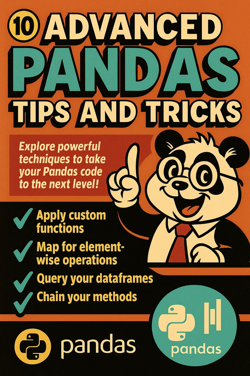
Advanced Pandas tips
Now it’s time to explore advanced Pandas techniques that will make your code more efficient, expressive, and Pythonic.
29 May 2025 - 4 months ago