
Core UI Components
Written by: Marlon Colca
Posted on 08 Sep 2025 - a month ago
nextjs typescript clones
Build reusable components for the catalog grid and horizontal rows.
- 01
- 02
- 03
- 04Core UI Components
- 05
- 06
- 07
- 08
- 09
- 10
- 11
- 12
- https://github.com/coins5/next-netflix-clone
[EN] Building a Netflix style Clone with Next.js
Links
Goal: Build reusable components for the catalog grid and horizontal rows.
Files 🗂️
src/components/MovieCard.tsx: poster, title, hover polish, and progress bar.src/components/Row.tsx: horizontally scrollable row with arrows and gradient edges.
MovieCard (excerpt) 🎞️
// src/components/MovieCard.tsx
"use client";
import Link from "next/link";
import { useEffect, useState } from "react";
import type { Movie } from "@/lib/catalog";

export default function MovieCard({ movie }: { movie: Movie }) {
  const [progress, setProgress] = useState(0);
  useEffect(() => {
    try {
      const raw = localStorage.getItem(`vp:pos:movie:${movie.id}`);
      if (!raw) return;
      const data = JSON.parse(raw) as { t?: number; d?: number };
      if (data?.t && data?.d && data.d > 0)
        setProgress(Math.min(100, (data.t / data.d) * 100));
    } catch {}
  }, [movie.id]);

  return (
    <Link
      href={`/watch/${movie.id}`}
      className="group relative block w-[180px] flex-shrink-0"
    >
      <div className="relative aspect-[16/9] overflow-hidden rounded-md bg-[#222] ring-1 ring-white/10">
        {movie.poster ? (
          <img
            src={movie.poster}
            alt={movie.title}
            className="h-full w-full object-cover transition-transform duration-300 group-hover:scale-[1.05]"
          />
        ) : (
          <div className="flex h-full items-center justify-center text-sm text-white/70">
            {movie.title}
          </div>
        )}
        <div className="pointer-events-none absolute inset-0 bg-gradient-to-t from-black/60 via-transparent to-transparent opacity-0 transition-opacity duration-200 group-hover:opacity-100" />
        {progress > 0 && (
          <div className="absolute inset-x-0 bottom-0 h-1 bg-white/20">
            <div
              className="h-full bg-red-500"
              style={{ width: `${progress}%` }}
            />
          </div>
        )}
      </div>
      <div className="mt-2 line-clamp-1 text-sm text-white/90">
        {movie.title}
      </div>
    </Link>
  );
}
Row (excerpt) ↔️
// src/components/Row.tsx
"use client";
import { useRef } from "react";
import type { Movie } from "@/lib/catalog";
import MovieCard from "./MovieCard";

export default function Row({
  title,
  items,
}: {
  title: string;
  items: Movie[];
}) {
  const scroller = useRef<HTMLDivElement | null>(null);
  const scrollBy = (dir: 1 | -1) =>
    scroller.current?.scrollBy({
      left: dir * (scroller.current.clientWidth * 0.9),
      behavior: "smooth",
    });
  if (!items?.length) return null;
  return (
    <section className="group/row relative mb-8">
      <h2 className="mb-3 text-lg font-semibold">{title}</h2>
      <div ref={scroller} className="flex gap-3 overflow-x-auto pb-2">
        {items.map((m) => (
          <MovieCard key={m.id} movie={m} />
        ))}
      </div>
      <div className="pointer-events-none absolute inset-y-10 left-0 w-16 bg-gradient-to-r from-black to-transparent opacity-0 transition-opacity group-hover/row:opacity-100" />
      <div className="pointer-events-none absolute inset-y-10 right-0 w-16 bg-gradient-to-l from-black to-transparent opacity-0 transition-opacity group-hover/row:opacity-100" />
      <button
        onClick={() => scrollBy(-1)}
        className="absolute left-2 top-1/2 z-10 hidden -translate-y-1/2 rounded-full bg-white/10 p-2 text-white hover:bg-white/20 group-hover/row:block"
      >
        ◀
      </button>
      <button
        onClick={() => scrollBy(1)}
        className="absolute right-2 top-1/2 z-10 hidden -translate-y-1/2 rounded-full bg-white/10 p-2 text-white hover:bg-white/20 group-hover/row:block"
      >
        ▶
      </button>
    </section>
  );
}
Notes 📝
- Start with
<img>for posters to avoid configuring remote domains. Switch tonext/imagelater and setimages.remotePatternsinnext.config.tsif using external images. - Keep card width manageable (e.g., ~180px) to fit more items per row.
Why this composition 💡
Rowowns horizontal scrolling and navigation affordances;MovieCardstays dumb and reusable.- Card hover effects are purely visual (transform + gradient) to keep reflow minimal and the UI smooth.
Accessibility and UX ♿
- Buttons for left/right scrolling are keyboard/AT‑friendly and visible on hover; consider adding
aria-live="polite"hints if rows update dynamically. - Maintain a visible focus ring on cards when tabbing (Tailwind defaults + browser focus styles).
Performance tips 🚀
- Keep images reasonably sized (e.g., 320–480px wide) and set
loading="lazy"to avoid blocking initial paint. - Avoid heavy box‑shadow blur on dozens of cards; prefer lightweight gradients and transforms.
Verify it works ✅
- Ensure rows are scrollable with trackpad/mouse and arrow buttons.
- Hover a card: it scales slightly, gradient appears, and progress bar shows when applicable.
- Tab through cards to confirm focus visibility and keyboard navigation.
🔜 Coming up next
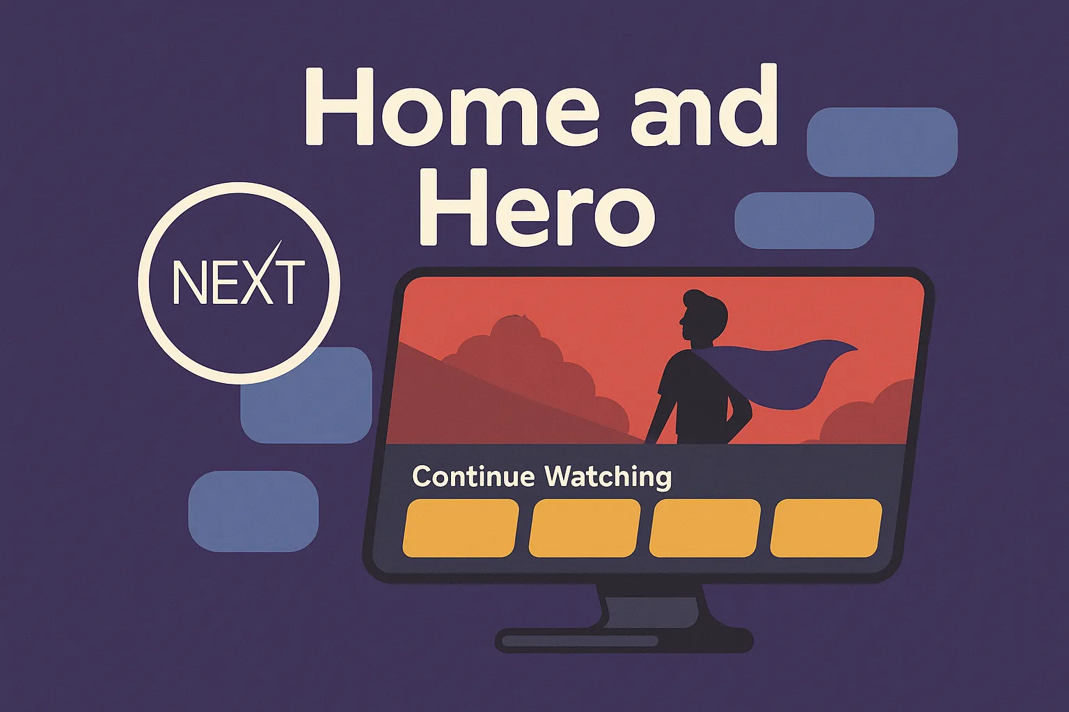
Home and Hero
Compose the Home with a header, a hero banner, Continue Watching, and category rows
09 Sep 2025 - 25 days ago